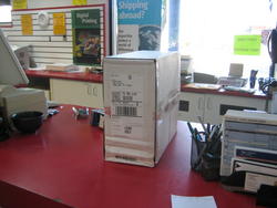
A couple of days ago, I got the following fast-casual promotional flyer in the mail:
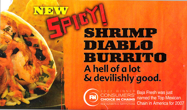
One thing that I immediately noted (and commented on) was their copy: a bold call. (For a bold burrito?) By way of example, at Panic we try to generally err on the side of marketing caution — the world is full of many viewpoints, and we don't want to alienate — but even so, we once got an e-mail from a customer upset at our web-use of the term "kick-ass". Noted.
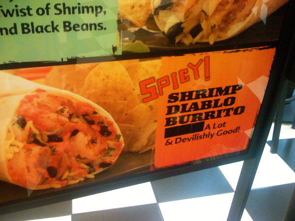
Today we headed to Baja Fresh to try out this magic new Diablorito. When we got there, though, the marketing had changed
just ever-so-slightly...Fantastic! "Uhh some stuff and also some things and don't worry about it also.. A LOT!"
The menu board featured an even more elaborate correction: an entire adhesive panel to replace the previous text.
Well played.
I'm a long-standing fan of sticker-fixes. Why pay to print an entirely new, corrected piece, when you can roll out old-school instantly hot-swappable physical bug fixes to every client using your distributed workforce? If I see a sticker-fix on packaging I will always,
always peel it back to see what it was in the first place — it's usually insightful to see what gets changed and why. My previous favorite was a gaming peripheral that secretly revealed an entire back-of-a-box filled with 100% hilarious bad-English, but I think I have a new winner here...
El Diablo indeed!
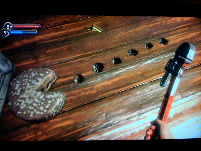
Yes. Bioshock is amazing. You know this already.
There are times when I'd just sit in the corner of a room next to a record player spinning some crackly Billie Holiday, soak in the leaky under-scenery, and listen to the amazing radio messages as they unravel an series of stories with genuine
characters in the most old-fashioned and new-fashioned of ways simultaneously. Then I'd move about three steps per hour to the next room, eating every candy bar in sight and hacking every camera I could find, self-terrifyingly stalling to avoid what's undoubtedly to come. Talk about the the perfect antidote to my long-standing complaint about the infinite Brown Devil Gun Zombie Space Linebacker Shooters we usually get — please, give us more of this. More points of view. More ideas.
(Besides, who doesn't love a game where a level designer makes a
familiar gaming icon out of moldy old cheese and a handful of bullet holes?)
All this being said, I almost didn't get a chance to play Bioshock.
Because, you see, I'm now on my fifth Xbox 360.
Ready for another trip to the magic land
— I won this Xbox 360 in the Mountain Dew contest after learning about a quickly-closed loophole in the rules that allowed anyone on Earth to generate lots of free contest entries without having to buy soda and stack the contest odds in their favor.
It eventually broke. I suspect the loophole, and easy win, ruined my karma forever.
Xbox #2 — This one lasted a little while longer, but eventually games started to completely lock up forcing a hard reboot. On the plus side, the freezing almost felt like a new, extra-challenging minigame built into all games — while playing
The Darkness, it might have been harder trying to pre-empt and avoid inevitable freezes than it was to finish the game itself. I very eagerly shipped off this box, hoping to get it back before Bioshock.
Xbox #3 — Freshly repaired and just in time, with the brand new heat sink fix for the GPU, I had high hopes for this little guy. But a few weeks into Bioshock madness — terrible news. I turned on the game, and the title screen was filled with gallons of oscillating blue lines, all over the place. Back to the Dashboard, bright colors turned into somber, gray ones. I quickly turned the machine off, took a few deep breaths, turned it on and... nothing.
No video output. Sound? Fine. Video? Ridiculous! I can't stress this enough:
this machine was manufactured in early August, had the brand new heat-sink "fix", and still died two weeks later. This is bad! (Worst still, it wasn't technically a "red ring" problem, so it wouldn't have been covered with the newly-extended warranty.)
Xbox #4 — Hoping to start anew, and not wanting to lose any more precious Bioshock-time, I bought a brand new Xbox 360 at Target, a premium with HDMI output. Almost immediately, Bioshock started pausing for extended periods of time in the middle of heated action. Better still, most textures were taking an incredibly long time to load — I'd enter a room, run up to an object, and it would be an unexciting gray blob of polygons. Five seconds later, BLAM! A texture map! Hey, it's a slot machine! Ten seconds later, BLAM! Hooray, a shadow! Thirty seconds later, BLAM! An additional level of detail! While it was honestly a pretty cool effect, I suspected a bum DVD drive, saw a bleak future, and took it back for a quick in-store exchange.
Xbox #5 — Currently working, and keeping the games flowing while Xbox #3 heads back to the repair depot today. Wish Xbox #5 luck, people!
In all honesty, does anyone know how it got this bad? We talk in the office about how an Xbox 360 is like three G5's shrunk down into a small, poorly-ventilated plastic case — surely, using Mac G5's as a reference point, they could have easily predicted thermal issues would be pretty serious? How did this manage to go on for so long? And jokingly-most-importantly, somebody got fired for this, right? I mean, there's a dude, or team of dudes, at Microsoft, who at the very least cost the company
one billion dollars in extended warranty repairs. One billion dollars! I don't know much about the corporate culture at Microsoft, but that's got to be worth a pink slip or two, right?
I'd love to hear your Xbox 360 repair stories. And I have one request, Microsoft, if you're listening:
Would you kindly fix your console?
(Which, by the way, would make a great band name.)
The toolbar in Coda — it doesn't seem so special, does it? In fact, you might not have even noticed that it's any different than any other toolbar on the Mac. But oh, my friend, you would be ever so wrong.
It may look simple, but the toolbar turned out to be one of our bigger engineering challenges. As the French often say, "the smallest brioche cooks as long as the biggest baguette" — an age-old expression that, despite being both factually and scientifically incorrect, really hits home here.
The Story
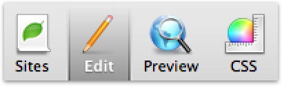
This is how a Mac OS X unified toolbar looks, when it's in a "selection" state:
I'm not a huge fan of how that looks. OK, sure, it's not like it's committing pixel genocide or anything — but the hard, rounded bevel always felt a little bit Mac OS 9 to me and, worse still, reminds me of group boxes, the long-lost and visually-face-punching old fashioned way to group controls together. Yes sir, it was time to move on...
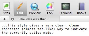
...and it was time to design something new! In about a half-hour, while working on the giant Coda interface mockup in Photoshop, I threw together a new idea for a selection style:
Or, to show it in context:
"Well now — that just might work!", I thought to myself. Probably. It improves the link between the toolbar selection and the content area (almost like a tab), the active text being white helps it "pop", and it has a nice physicality to it. Overall, I gave it a B+. Hopefully you agree. If not,
sit on it.
So, officially passing the cyber-baton, I gave the Photoshop file over to the engineers, and eagerly looked forward to the finished product.
Three Pixel Tour
Unfortunately, the finished product would be a long time coming. The nemesis?
Three pixels:
Yeah. That's all. Three pixels. We couldn't touch 'em. Simply put, a regular toolbar never draws down there, so things get real cagey if
you do. You can, through some degree of trickery, throw some pixels in there, but the OS never tells you to redraw that area, and never properly redraws that area itself, so if the toolbar changes even
slightly, your toolbar is gonna instantly look broken. You wouldn't think three pixels would be a big deal, would you? Technically, it was a mountain of pain. And creatively, connecting the toolbar all the way to the bottom was a key part of this design idea. We subclassed everything and everything's mother, and eventually came up with some crazy solutions that
mostly worked well, but had two problems: the code was skanky (which, to be honest, didn't bother me as much, since the user never sees skanky code, but I can empathize with that not-so-fresh feeling), and the toolbar broke apart in all sorts of little edge cases (like showing/hiding the toolar, etc.). Ultimately we were never happy with the hacks. We threw in the towel.
And we ended up writing our own very faux-toolbar from scratch.
That's right: we're not using the system toolbar in Coda.
To apologize, that's why you can't re-arrange the items in the Coda toolbar — re-implementing all of our own code to make that common toolbar activity work would have been way more trouble than it was potentially worth. (Hands up if you wish you could re-arrange the items in the Coda toolbar!) But yeah, it's not real. All because of three pixels. And all because we didn't want to settle. About that...
Recouping
One of my internal mantras for the design of Coda was to not do something just because "that's how it's done". I tried to force myself upon the discomfort of making calls that contradict tradition. This wasn't always successful, and it's far easier said than done. But while Panic has traditionally been all about the HIG, Apple has shown us time and time again that there's more to life than hard-line metrics and by-the-book guidelines. I wanted to push our boundaries a little bit — apply a little bit of "Delicious Moderation", if you will.
But there's one problem, of many potential problems, about forging your own path as a designer: you might encounter a Three Pixel Conundrum. You may come up with a cool idea, but you may never expect that three pixels will spring up and make your very simple idea a technical nightmare. That then becomes a engineering/design issue, and that means you need to choose your battles carefully, carefully weighing where an engineer is coming from but also considering what's best for the app and for the user. The engineers will not appreciate this three-pixel stupidity, because there will probably be, oh, actual
features they should be implementing instead, while you're sitting around worried about this seemingly-unnecessary fancy toolbar that you love oh-so-much. But you know the app will be better for it. So, is such a thing worth pushing for? There's no easy answer, just a gut feeling, you'll know your dudes better than I do. I chose this battle. I knew that the guys here ultimately care about the little things, and I knew that despite the frustrations they encountered, my gut didn't want to give up and let something that I never liked in the first place, even if it came from Apple, live longer it should just because it's "the way it looks". I can't thank the guys enough for sticking with it, and I'm really proud that we got it to work, even if it's wasn't.. easy.
Twist Ending

By way of comparison
Now, none of this junk would have been necessary if this toolbar selection in Mac OS X would have looked awesome in the first place, right?
So, while we the guys worked on the implementation, I initiated a "Plan B". I tried my best to plant a bug in the ear of Apple: "Hey, you guys should really spiff this thing up in Leopard!"
I didn't expect much, if anything at all. Suggesting this kind of thing to Apple is often like putting a message in a bottle, then having a hobo collect and recycle that bottle. But, against all odds, there was a gentle whisper in my ear at WWDC: at some point in the future, the toolbar selection style might get... revised a little. Or something along those lines.
I don't know about you, but I can't wait to see the final results in Leopard!To which I say: hot business! Possibly soon we can use a real toolbar again! Best Leopard feature ever! ;)


