
Fancy Cabel
After the wedding, sometimes people would ask me if everything feels different or more great now that we're married. When I would tell people "actually, not really!", I could naturally sense a little bit of romantic disappointment in their faces, like I'm the Harlequin Grinch. But I don't mean "not that different, yawn" — I mean "not that different, because, honestly, it's always been great." [AWWWW.MP3] My overall advice: when you know, you'll know.
Anyway, I don't want bore you with the personal blah blah blah. Instead, I'd like to talk to you about design...
Wedding design! (Guys? Guys? Stay with me here!)
The Brainstorm
I spent a too-long amount of time brainstorming the foundation of our design. First, I knew I wanted to incorporate Nicole's love of visual contrast — she who is so fond of a super-dark gray cloudy sky with a burst of a blue showing through, or a beautiful flower popping up through tired concrete. Second, I knew that the design had to represent both of us, a little piece of each. I know, right? As much as I'd love to make a wedding invitation with photos of say, photos of the latest flavors of Sun Chips ("You're invited to our peppercorn-ranchuptuals!"), it probably wouldn't play too well outside of, uh, me.Then, two key words popped into my mind:
Pixel flowers.
Retro 8-bit quirky and fun but elegant and beautiful and colorful. Perfect. I immediately remembered seeing a magazine illustration by the amazing Nick Dewar of pixelated blossoms somewhere once. With Nick's illustration serving as mental inspiration (thank you, Nick!), it was time to get cracking.
Save The Date
The first thing we had to tackle was the age-old "save the date". Due some tardiness with the art director (sorry!), we decided to do it electronically to get it out the door instantly. Otherwise there'd be no date to save.Enter friend and artistic genius David Lanham, out of the Coda icon. He graciously found time to to lend his illustrative talents to this project.
The first bit David cranked out was a perfect little pixel illustration of myself and Nicole, that I hoped we could use in a variety of places throughout the project. It went through some fun variations:
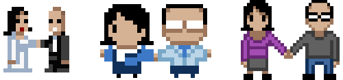
As you can see, we started off super micro (and I looked a little bit like Gob from Arrested Development about to perform a magic trick), then we got super (super) deformed, and finally with a bit more nudging I think David nailed it with the last one — it's cute, with just a dash of disturbing. Just like us! Uhh..
Illustration in hand, it was Cabel's turn. A few fonts, some colors, a clean layout, and a little extra something on my t-shirt (what is that? a tri-force? I honestly don't know why I added it) and it was ready to be e-mailed!
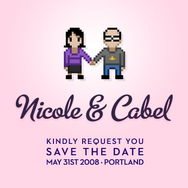
That's it. Simple. To the point. Fun.
Technical notes: I used e3 Software's truly excellent Direct Mail application to send it out. It's got a great statistics view that can show you how many people opened up the message, assuming their mail reader loads images by default. Font wise, that's Metroscript by Alphabet Soup for the logotype, and House Industries' Neutra 2 for the details. I used Neutra 2 primary because I wanted to be the last person to use this font. I love it, but I literally see it everywhere, all day long. So, sorry, suckers! You're not allowed to use this font because I'm the last guy. I called it. It's done, font closed. Use something else. Myself included. Don't look at the Coda header.
The Invitation
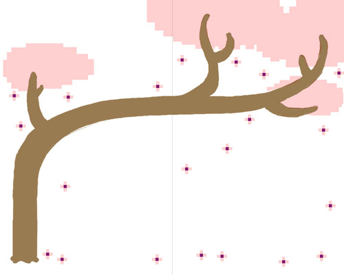
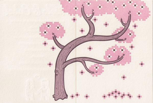
Onto the master illustration itself. Once I fully explained what was on my mind, David quickly cranked out a sketch of the core idea: an elegant tree, with little pixel flowers on it.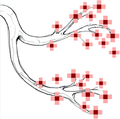
I wanted to take it into more "tree" than "branch", so I pitched the idea of having it wrap-around to the back of the invitation. David translated this into a rough layout sketch:
I liked it! But the tree seemed a little super-wide. With that in mind, it was time to make it "real".
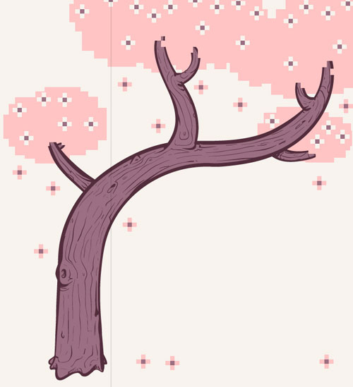
Finally, wanting to shed the peach color and fill more space after committing to a text-free cover, we arrived here:
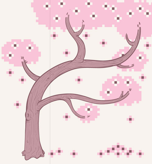
Awesome. Yay, David! It was time to start getting print-ready.
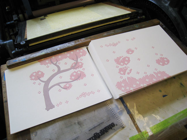
Pre-Press
I had decided on using letterpress for these invitations. It's good for small print runs, and it's also such a visceral, physical technique. If you ever get a chance to watch letterpress machines in action, it's mesmerizing and also tinged with danger. I found a great, local, and now-highly-recommended print shop — Egg Press — who were happy to tackle the job.I went through their paper samples and picked one, but ink colors were harder for me — I looked at their stock inks but none of them were quite. It was time to bust out the Pantone book and pick three spot colors (for an extra charge, naturally). For the record, it's Pantone 510U, 5225U, and 5205U!
Then I re-formulated the art to fit the correct paper size, drawing an extra branch here and a flower there.
I was done. It was printin' time.
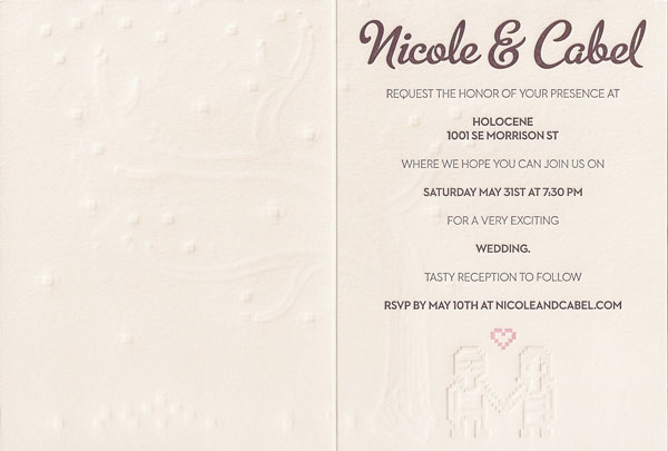
Finished Product
The invitations were now ready to go.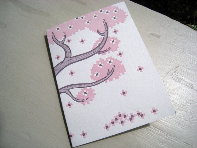
I love the texture, rough print, and embossed feel of letterpress. It made the "physical" nature of this job even more fulfilling.
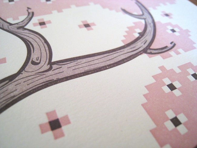
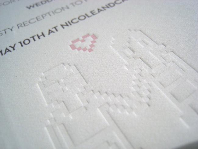
There was one final surprise on the finished piece.
Since letterpress creates an actual physical impression in the paper when it stamps the ink, I thought it would be interesting to do one letterpress plate without ink — our pixel selves, subtly debossed on the inside.
As a bonus, since the impression runs deep, we're also embossed on the outside, and it's carefully aligned so that it looks like we're standing under the tree. Sort-of.
That's it! Here are scans of the finished piece:
Custom Stamps
One last stop before the postal office: custom stamps. We decided to use zazzle.com for this — as should be glaringly obvious. The giant zazzle advertisement (zazzvertisement?) on every stamp was a huge negative, but a high-quality pixel stamp was hard to pass up.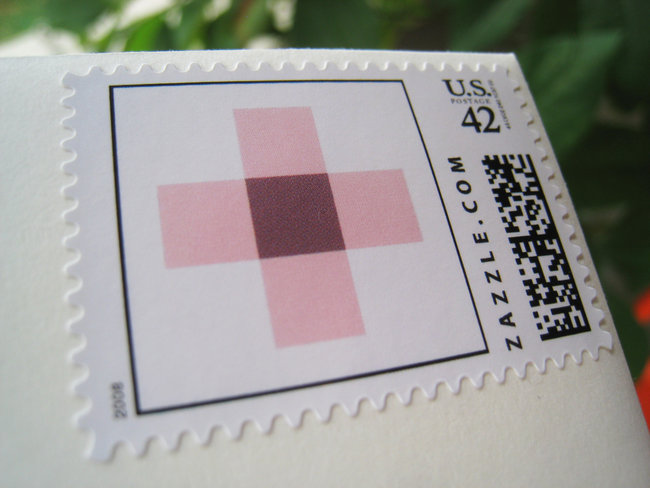
The Event
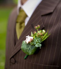
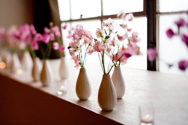
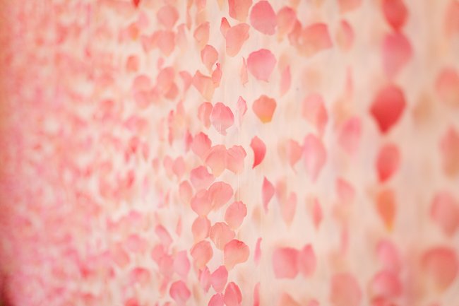
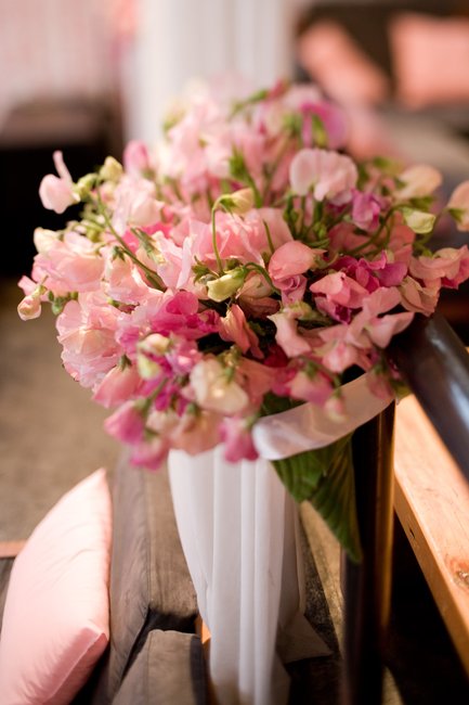
This fell into Nicole territory — I did the print, she did the space. But I thought she did a really stunning job designing the venue — the colors, the flowers, the details, everything kept the original idea flowing through to something physical, gussying up an industrial warehouse-style bar/venue with beautiful elegance. It was, as they say, like a dream.I'll let these photos speak for themselves!
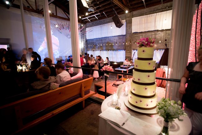
Yes. It's true. That is a pixel flower cake. Making that happen? High point of my life so far.
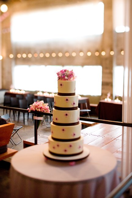
Confidential to those getting married in Portland: the amazing cake came from Bakery Bar, the gorgeous flowers by Francoise Weeks, stunning-to-everyone photography by Robert McNary, and the venue was the accommodating and incredible Holocene. Oh, and my suit? 100% Duchess.
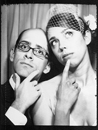
The Photobooth
A quick wedding recommendation: for some really fantastic, non-cheesy photographic memories of your guests, look for a local distributor of good old fashioned photo booths. None of this fancy-pants digital stuff — we're talking a green, incandescent bulb that says "smile", little strips of paper sent by an ancient motor into various vats of chemicals, dropped into your hands still wet, a cool little honeycomb texture running through the paper and an ever-so-slight sepia tone. These are the real memories, four classic frames at a time.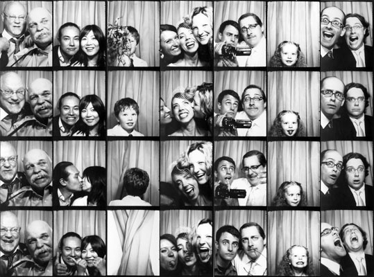
The Gifts
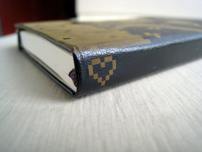
As a "thank you" gift to the wedding party, we decided to get some laser-etched Moleskines made. (Can you tell I enjoyed this project?) I sent the art to Joe at Engrave Your Tech, who happened to be here in PDX, and the books were made super-quick. He also let me individualize each book with the person's name on the spine. They turned out amazing. (Sadly, it looks like Joe's not engraving them anymore (yipes!), but I bet he'll come up with something even better.)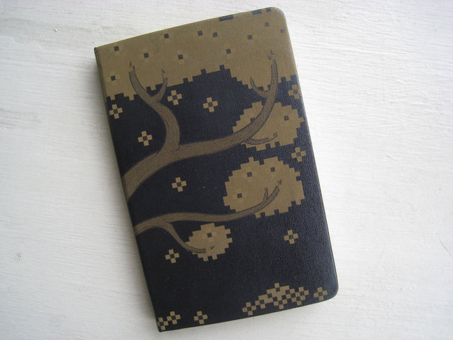
The Ring
The very, very last step in the process: my wedding ring. A gift from Nicole, it holds a secret inside: a tiny pixel flower. You'll never see it, but I'll always know it's there.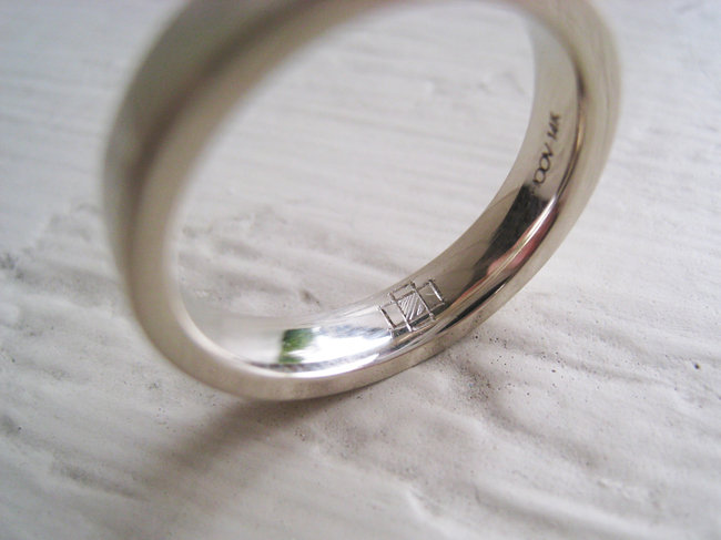
Finally, Something Cool From Noby
A little bit before the wedding, a special gift arrived from Japan: custom-made chocolates with our little pixel selves printed on the package. These DECOチョコ (deco-choco) treats came from Noby, one half of Panic Japan. Talk about hitting your target audience — I was amazed. Let this be the best snack food picture I will ever post on this blog!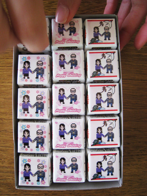
Phew
The rest was a blur.My great friends Alex and Steve gave killer best-man speeches: embarrassing (there's no shortage of Cabel stories) but also very heartwarming. (Also, Steve delivered this great line: "If you asked me to describe the business relationship between Cabel and I, in Star Wars terms, I would say he is like the R2-D2 to my C3PO. He rolls around, interfacing with computers, solving problems, and making strange beeping noises, while I flap my arms helplessly, and shout 'We're doomed!'")
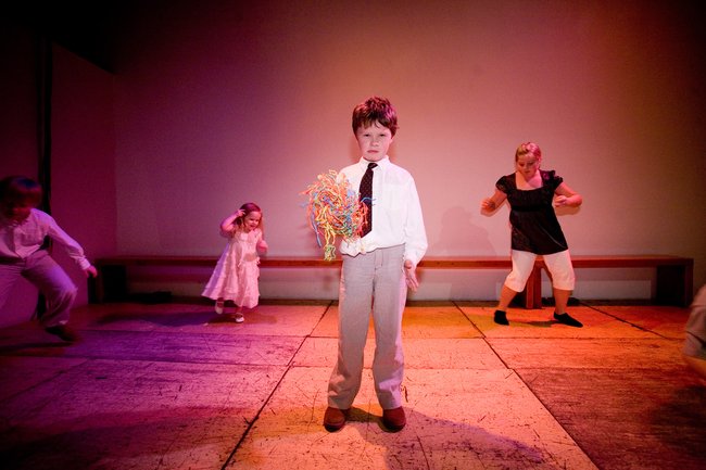
People ate many foods, drank many things, hugged a lot, saw goofy old pictures of both of us in an amazing slideshow my folks put together, danced like crazy to an amazing mix from the Juice Team on a tiny stage with the people I love, and talked to friends both old and new. And there was delicious cake. So much cake.
This was a great day. And in the end, before we knew it, it was time to close the place out and hop in the car, slightly melancholy that possibly the greatest party of our lives was over but more than slightly excited that the rest of everything was starting right then and there, in the middle of the automatic car-wash at the 76 station, in the early hours of the next day, as a shaving-cream "cabel + nicole" was washed off the hood but, really, will always be there.
Totally married. Totally awesome.