

(Which, by the way, would make a great band name.)
The toolbar in Coda — it doesn't seem so special, does it? In fact, you might not have even noticed that it's any different than any other toolbar on the Mac. But oh, my friend, you would be ever so wrong.
It may look simple, but the toolbar turned out to be one of our bigger engineering challenges. As the French often say, "the smallest brioche cooks as long as the biggest baguette" — an age-old expression that, despite being both factually and scientifically incorrect, really hits home here.
The Story
This is how a Mac OS X unified toolbar looks, when it's in a "selection" state: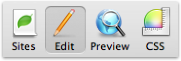
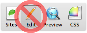
I'm not a huge fan of how that looks. OK, sure, it's not like it's committing pixel genocide or anything — but the hard, rounded bevel always felt a little bit Mac OS 9 to me and, worse still, reminds me of group boxes, the long-lost and visually-face-punching old fashioned way to group controls together. Yes sir, it was time to move on...
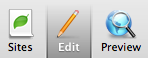
...and it was time to design something new! In about a half-hour, while working on the giant Coda interface mockup in Photoshop, I threw together a new idea for a selection style:
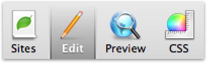
Or, to show it in context:
"Well now — that just might work!", I thought to myself. Probably. It improves the link between the toolbar selection and the content area (almost like a tab), the active text being white helps it "pop", and it has a nice physicality to it. Overall, I gave it a B+. Hopefully you agree. If not, sit on it.
So, officially passing the cyber-baton, I gave the Photoshop file over to the engineers, and eagerly looked forward to the finished product.
Three Pixel Tour
Unfortunately, the finished product would be a long time coming. The nemesis? Three pixels:Yeah. That's all. Three pixels. We couldn't touch 'em. Simply put, a regular toolbar never draws down there, so things get real cagey if you do. You can, through some degree of trickery, throw some pixels in there, but the OS never tells you to redraw that area, and never properly redraws that area itself, so if the toolbar changes even slightly, your toolbar is gonna instantly look broken. You wouldn't think three pixels would be a big deal, would you? Technically, it was a mountain of pain. And creatively, connecting the toolbar all the way to the bottom was a key part of this design idea. We subclassed everything and everything's mother, and eventually came up with some crazy solutions that mostly worked well, but had two problems: the code was skanky (which, to be honest, didn't bother me as much, since the user never sees skanky code, but I can empathize with that not-so-fresh feeling), and the toolbar broke apart in all sorts of little edge cases (like showing/hiding the toolar, etc.). Ultimately we were never happy with the hacks. We threw in the towel.
And we ended up writing our own very faux-toolbar from scratch.
That's right: we're not using the system toolbar in Coda.
To apologize, that's why you can't re-arrange the items in the Coda toolbar — re-implementing all of our own code to make that common toolbar activity work would have been way more trouble than it was potentially worth. (Hands up if you wish you could re-arrange the items in the Coda toolbar!) But yeah, it's not real. All because of three pixels. And all because we didn't want to settle. About that...
Recouping
One of my internal mantras for the design of Coda was to not do something just because "that's how it's done". I tried to force myself upon the discomfort of making calls that contradict tradition. This wasn't always successful, and it's far easier said than done. But while Panic has traditionally been all about the HIG, Apple has shown us time and time again that there's more to life than hard-line metrics and by-the-book guidelines. I wanted to push our boundaries a little bit — apply a little bit of "Delicious Moderation", if you will.But there's one problem, of many potential problems, about forging your own path as a designer: you might encounter a Three Pixel Conundrum. You may come up with a cool idea, but you may never expect that three pixels will spring up and make your very simple idea a technical nightmare. That then becomes a engineering/design issue, and that means you need to choose your battles carefully, carefully weighing where an engineer is coming from but also considering what's best for the app and for the user. The engineers will not appreciate this three-pixel stupidity, because there will probably be, oh, actual features they should be implementing instead, while you're sitting around worried about this seemingly-unnecessary fancy toolbar that you love oh-so-much. But you know the app will be better for it. So, is such a thing worth pushing for? There's no easy answer, just a gut feeling, you'll know your dudes better than I do. I chose this battle. I knew that the guys here ultimately care about the little things, and I knew that despite the frustrations they encountered, my gut didn't want to give up and let something that I never liked in the first place, even if it came from Apple, live longer it should just because it's "the way it looks". I can't thank the guys enough for sticking with it, and I'm really proud that we got it to work, even if it's wasn't.. easy.
Twist Ending
By way of comparison
So, while we the guys worked on the implementation, I initiated a "Plan B". I tried my best to plant a bug in the ear of Apple: "Hey, you guys should really spiff this thing up in Leopard!"
I didn't expect much, if anything at all. Suggesting this kind of thing to Apple is often like putting a message in a bottle, then having a hobo collect and recycle that bottle. But, against all odds, there was a gentle whisper in my ear at WWDC: at some point in the future, the toolbar selection style might get... revised a little. Or something along those lines.
I don't know about you, but I can't wait to see the final results in Leopard!
To which I say: hot business! Possibly soon we can use a real toolbar again! Best Leopard feature ever! ;)
66 Comments:
I really like to entertain consistency. If every developer out there just did a new toolbar style for what they thought "looked good," we'd have an incredibly inconsistent looking GUI (beyond what we already have). For an example of this, take a look at the many tab implementations in 3rd party apps... it's disgusting. Some of them look great, some of them look horrid, none of them look the same.
On a personal level about Coda's style itself, the reason I prefer Tiger's style is that I find the hard lines and dark gradients a bit too harsh against the unified background. The gradient and lines itself is a great idea, but the contrast is just so heavy. However, with Leopard's default window style being so dark in the first place, it'll fit in pretty well.
On the Leopard screenshot, I've enjoyed what they've done there, especially since they brought the gradient back out at the bottom instead of making it deeper as in Coda. I was excited to see it pop up as a nice "happy medium" between the two styles (Tiger's and Coda's).
And as a side note, it took me 5 times to finally get a captcha I could decode :(
Except Cover Flow, that's a horrible idea. I defy you to quickly find anything in Cover Flow mode in iPhone/iTunes.
What I am trying to say is Panic's selected state rocks and Cover Flow sucks.
Thank you for the article and kudos to your attention to detail.
That is all.
Additionally, people hating on CoverFlow, I love it (in iTunes) because all my music has cover art, and it has helped me listen to new music which I would barely touch earlier because it helps me pay attention to every item.
Cover Flow is not a more efficient browsing method, but it is a better, more realistic browsing method. It helps you pay far more attention to a single item at a time while browsing than you would in another browsing layout.
I did the 30day trial of Coda... but found that the intface got in the way of my work flow.... I was triping over the buttons and tabs. Especially when switching from an an .html to .css doc.
Probably not your dept. but Find and Replace across a whole folder was sorely missing (or hidden ) forcing me back to BBedit and totally negating the benefit of FTP local / remote syncing.
In other words... next time, please improve the functionality of the app before fussing over 3px.
I'd really an app like Coda but its not quite there yet. Cheers!
And if your screenshot of the Leopard Finder is accurate, it is further proof that the Finder team pays no attention at all to the UI evangelist team at Apple...
As I mentioned, it was very hard to weigh the importance of the "little things" against huge things. That's not an easy balance for a 1.0 product. But while I might make it sound above like the toolbar brought the company to a standstill, in reality with a multi-person team working on Coda, work continued regardless of the three pixels... and the amount of work involved for the toolbar does not even come close to comparing to the amount of work for implementing a major feature.
We're still moving. The toolbar provided a bit of polish, and helped 1.0 stand out a little bit more, but most importantly laid a solid UI foundation for what's yet to come. Stay tuned!
As for Coverflow - it's not about efficiency, it was always about replicating the feeling of flicking through your albums / CDs. You start out looking for Kevin Ayers and along the way pull out something completely different. Although I suppose it should have been 'Spineflow' for realism. Hmm. Now there's an idea . . .
As for the new style, it's not just the Finder — It appears that this new selection style is allegedly a new default for all Aqua selection-style toolbars. Another picture here...
All that being said, you'll notice that Apple's (possible) version is down to two pixels...
As far as rearranging the toolbar, I do think that would be a nice feature. I would mix up the order if possible. Do you plan on adopting the new cocoa toolbar if Apple goes with the current design?
Yeah, I know... sit on it... ;-)
The graphical interface is far superior and more appropriate for today than the OS UI. The attitude of sticking to what YOU wanted to do is even better. Apple's culture is built on people that are "not fond of rules and have no respect for the status quo".
keep on trucking.....
Some more background in terms of losing the re-arranging functionality:
You have to realize that the Coda toolbar is very unique: there's nothing to really customize. It's not like Mail, where there are a ton of optional buttons and actions you can put in the toolbar. Coda has six items, and they're all functional modes of the program that you don't want to "remove". There's not a single Coda toolbar item that is an "action" -- it's really more of a switcher, which is critical.
In other words, you've never felt the need to customize the "Preferences" toolbar in Safari, right? Those are all important sections of Preferences that you always want around, because you never know when you'll access them. Coda's toolbar exists in much the same way.
That's why we felt OK not have re-arranging in 1.0: fortunately, it's not something that comes up often, if ever, as a request from users. It also helps that we took the time to duplicate all of the other standard toolbar functionality, including different icon sizes and text-only modes.
With enough requests we absolutely would have, implemented our own toolbar customization code — but when we got wind that the toolbar was changing for the better — "officially" — we knew that would be a better choice.
Hopefully this helps you understand that the decision wasn't made lightly, but the omission makes better sense in Coda. If the toolbar was more of a traditional toolbar, I can honestly say that I would have shelved the idea for lack of customization.
So, knowing what we know, and weighing everything very carefully, I really can't say to you that we wouldn't do it again in the future. We will always strive to make the right calls, in the right circumstances, with a lot of thought, but that also means thought into what we can do "better" than normal. Sometimes we'll be right, and sometimes we'll be wrong, and when we're wrong, we'll fix it. But as the OS and GUI design on the Mac)moves forward, we have to be comfortable with taking more chances — carefully.
And if you do - please publish how...
(I ask, because I have gone through a similar experience as you trying to accomplish this on my own little text editor without success).
Cheers,
D.
The anxiety is understandable, but I doubt that it really does much to produce good code or good software. And certainly the defenses, the attempts to substitute measurement for a necessary ambiguity, can sometimes do it all some harm.
It seems possibly important that every project, no matter how commercial, should have at least one person at any one time who is simply dreaming about the software. By dreaming I guess I mean something along the lines of what Jung described as "undirected thinking", associative, or an openness to what the psychoanalyst Bion referred to as "thoughts looking for a thinker".
I think this is an example of this kind of thinking. I think it is an example of one of the many things that can make such a program more open to its users, refreshing. And I'm not sure, really, if the interface specifics are quite as important as the pursuit of this kind of vision, and that vision's coherence with the rest of the interface, and the end direction of the software itself.
but it's an oddly moving thing to read.
I think the well look works if it's just one feature, and the tab look works better for a button that shows multiple feature options.
I think the well look works if it's just one feature, and the tab look works better for a button that shows multiple feature options.
But... I must be missing something.
I am running Tiger, and when I look at the Preferences pane in the Finder (or Mail, or Safari), I don't see a rectangle with rounded corners and 3 dead pixels at the bottom. I see a darker-gray area that goes all the way to the bottom, though different in style from Leopard's. Where would I see the 'old' style that you wanted to shy away from?
It's not just that for the sake of three pixels you threw away existing features like re-arranging toolbar items, you're also throwing away all future 'free' features added by Apple to the standard toolbar. What you're saying to your more technical users is 'our application might break in future versions of the OS because we wanted our toolbar to look a bit different'.
I'll pass, thanks.
Either way, I would prefer to be able to re-arrange the toolbar buttons. My preference is to place the sites button to the left of the Site Name badge. Then an adjustable space, then Edit + CSS, a dotted separator, then Preview, and remove Terminal + Books - since I never use them.
However, I do anxiously await Subversion integration. Tell me it is coming soon. :)
the developpers' choice is fine.
True, but the point of the comparison is that it's more likely to break than using Apple's standard toolbar, not any other part of Coda. The more 'roll-your-own' code you write, the more likely things are to break. I should give you the benefit of the doubt, but can you say, hand-on-heart, that there are less bugs in your toolbar implementation than Apples? Or that your toolbar implementation is more likely to work properly in a new version of the MacOS than Apple's toolbar?
While I love that you inspired Apple to change the global style of the toolbar I have some issues with the way you guys did your toolbar implementation.
Th whole split-view thing in Coda really breaks the visual concept that your toolbar design tried to get across.
Your toolbar design looks like it only applies to the the top split, but actually applies to whatever split has focus. I totally understand why you have it work this way, but it just breaks the mental model of the design.
BTW, love your toolbar, but I prefer Apple's conventions as well - I admire sticking to your guns approach (and it is beautiful), but there should be no loss in standard functionality in doing so.
My only complaints have probably already been aired. The workflow between .html, .css, and image files is a bit wonky. I'm a bit tired of a tab appearing for everything I happen to click on the left side (though I believe a Preference probably alleviates that problem), leaving me with a glut of tabs that trail off to the right.
In short, I'm going to buy this because I'm annoyed by some features or lack thereof. I'd rather my money do the talking that just the whining. :)
Some practical problems with the toolbar not being standard, besides having a problem with it looking different:
- I make my icons small and turn off text labels as soon as I install a program. If I can't figure out what an icon does, I can usually rollover it and get a tooltip, but your icons don't have tooltips.
- I can't right-click on the toolbar and choose the icon display (icon, icon and text, etc...) like I can in most OS X programs.
- The line that comes off the right part of the left sidebar also annoys me. Another "oh I don't like how other programs do it, so I'll just invent my own way" sort of thing that doesn't contribute to the interface. Mail uses a flexible space to line up the icons with the right of the sidebar. I have the option to remove it and align my icons all the way on the left. With Coda, I'm stuck with a dark unnecessary line right on my toolbar.
- There are items on the toolbar I would never use, like the books. I don't think the program should dictate to me what items I will always use. I like to keep my toolbars minimal and don't like to *always* see icons on my interface, that I never use, so prominently. Icons in a preference pane are out of my way when I close it. Toolbar icons are always there.
I think overall you guys are doing a great job with Coda, but I feel like you're getting so caught up in getting those customizations to look like the way you want them to that you don't have a chance to step back and decide if they're really necessary. And you're spending so much time on them that there's no way that you would decide to go back and change the interface to be more standard once you're done.
I'm jealous of your Photoshop skills and how cool Coda looks. For a 1.0 release you and the Panic team have done a wonderful job!
Yes, there are features needed, but Coda has already changed the way I build websites and I'm very addicted to its workflow. I can't wait to see what you guys are going to do next! Peace.
Ha ha...yeah, I'll start sitting....
Need I remind you of the rank amateur 3 pixel jog in IE web developers have to contend with plus every other nasty 90% of the day arguing with the IE's dismembering engine.
That's the telling line that distinguishes an artist from a sunday painter.
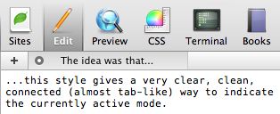
The first thing that strikes you when using Coda are the different "modes":
If they hadn't "felt" just right to switch between, the whole concept collapses.
The fact that it connects makes it really obvious what mode you're currently in and you never feel lost, despite having modes sitting above tabs that sit above the content.
Oh and it helps that the icons are The Shitz™.
Btw: I'm pretty jealous of Martin O's stack of Panic T-shirts... they're all he wears to work.
I better watch out for my next Mac app! :)
But maybe the main thing Apple changed is the forced 3-pixel space. If that's the case, and the graphics are optional, that will be nice.
Well done for shaming Apple into action along with other indie developers and showing them how they should do it...
Now if you can just try and influence them re. the new Dock...
Also, compromise the user ability to custom rearrange the toolbar is not worth the “extra“ pretty design.
Please don’t loose focus of Transmit development :-)
Coda is indeed an excellent application and it has features that I wish SubEthaEdit would too.
Thanks again for developing beautiful, reliable and affordable applications.
My take: I'm all for shedding convention, but there should be an end-user-beneficial reason for it. Years of using an OS will build expectations as to how things should function, which I believe Chris mentioned earlier. I haven't used Coda (all this conversation has got me curious though, heh), but I've gleaned that selecting different items from your toolbar puts the app in a different mode. This *is* different than most apps, so it makes sense to convey this with a unique, strong visual metaphor, as it looks like you are doing.
I will say I agree, the look of a selected item in the system's unified toolbar is atrocious! Maybe that's why I can't recall seeing it used anywhere.. not surprised it's being redesigned but congratulations on getting heard and thanks for helping it disappear :)
But "de gustibus non disputandum est".
Thanks anyway for sharing.
It's been quite a while since the initial release followed by a few quick fixes. However, even 1.0.3 has a number of issues, quirks and missing features / functions.
KORBY DESDE BUENOS AIRES, ARGENTINA
great article
korby from buenos aires, argentina.
Are you not trying to morph a toolbar into a tabstrip?
Design aside, it is not technically a toolbar if it is for switching screens, right?
You know the story about the US inventing the 'Space Pen' and the Russians using a pencil in space? Yeah...
CROSBY NASH BUENOS AIRES, ARGENTINA
Post a Comment