

On a brief road-trip up to Olympia, Washington yesterday, we stopped at a friendly Arco station to, well, get some gas, but also look for weird c-store snacks. Of course.
While there, I spotted this pretty classic bit of Human Interface Design at the payment station:
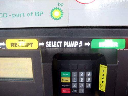
The instructional sticker, placed on the pay station, is valiantly attempting to explain to people how to pay.
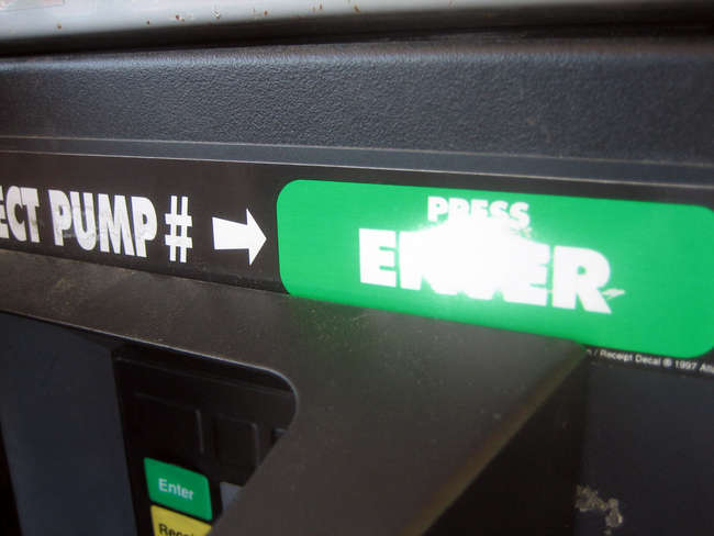
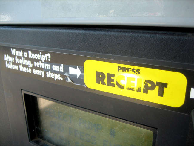
But, as you can see, instead of pressing the actual Enter/Receipt buttons, immediately below the instructions, people are desperately pressing the instructional sticker itself. (And not just once or twice — often enough that the printing has been almost completely rubbed off!)
Seriously, see it up close. And it's both sides, too.
While we could/should chuckle at zany dumb people — oh, heck, go on — I blame the designer. The fact that they needed to add a sticker in the first place should have been an immediate red flag that the overall design has fundamental problems. Consider alternatives quickly: is the LCD screen the problem? Is it hard to read? Since it can't be made higher because of ADA access, can it be made clearer, or more graphical and less textual, with better instructions? Can they use voice prompts ("now press the green enter button") tied to a big blue "help" button? Better yet, how about replacing the whole screen/keypad combo with a much-friendlier single touchscreen?
Still, even if they missed the dire "let's use a sticker!" klaxon, here's a good rule of thumb: don't make your instructions significantly easier to see / parse than the actual interface you're trying to explain. :)
Interestingly, this kind of stuff applies to software UI design as well. Any time we find ourselves having to over-explain a control, or hope that people read the documentation, or pray they stop and smell the tool tip, we'll usually back up and completely rethink what we're trying to do.
Regardless: hooray for people!
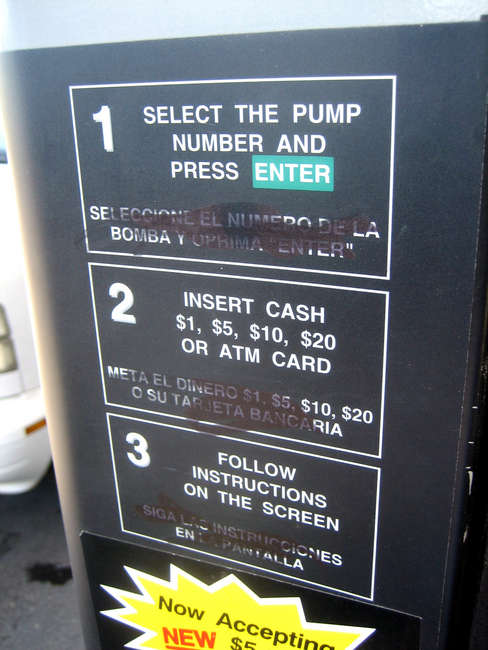
(For what its worth, someone at this gas station didn't like the Spanish instructions very much, either.)
15 Comments:
And yea, people are total retards about these sorts of things. I don't know if making the instructions any less stand-out-ish would have helped becuase then you'd just have people screwing it up / standing there with a stupid look on their face...
Definitely needs a total redesign.
I cry for those people and their lack of...brain.
You know that thing when you walk up to a door and push when you should have pulled, or pulled when you should have pushed? You know how you always feel a bit silly for getting it wrong?
Don't; it's not your screw up, it's the designer's.
You'll usually find that doors you've tried to pull have some sort of handle, and those you've tried to push don't; this is learned behaviour. And as any good UI designed knows – software or otherwise – one of the first rules is not to do anything that goes against learned user assumptions. (Or, at worst, only do so when there's a very, very good reason.)
By putting a big, obvious handle on a door, the designer is suggesting to anyone who walks up to it that it should be pulled open simply because this has been most people's experience up to that point.
Pressing the sticker marked enter isn't a very stupid thing to do; its entirely feasible that it covered a touch pad. With a few ignoble exceptions, users tend not to be stupid – just rushed. It's the job of designers everywhere to communicate meaning and information to help people get through life with the minimum fuss, something the designers of this system didn't quite get right.
[input?] PUMP #
THEN PRESS ENTER
RETURN FOR RECEIPT
What it means to say is that you have to come back to the machine after fueling if you want a receipt, but the first time I used one of these machines I spent some time looking for the 'return' button because I thought there was an 'OR' elided from the on-screen instructions.
Plus, their machines hate my debit card and centralized payment terminals are evil. Go from pump to terminal to pump (and then to terminal and pump again if you want a receipt). Evil.
But if you place the Speedpass over the logo that lights up, NOTHING HAPPENS. How hard would it be to make the area you're waving at light up?
Anyway, there are a lot of dumbasses at Exxons, because there are always big scratches of black plastic on the Tiger.
Post a Comment